
UX-UI Design | Branding | Germany

Scaling a Premium Medical Practice to 90% capacity.

Leading the end-to-end design strategy—from brand identity to Webflow development—resulting in a 90% booking rate within the first 3 months of operation.

Role
Product Lead
Timeline
12 weeks
Tech Stack
Webflow & Figma
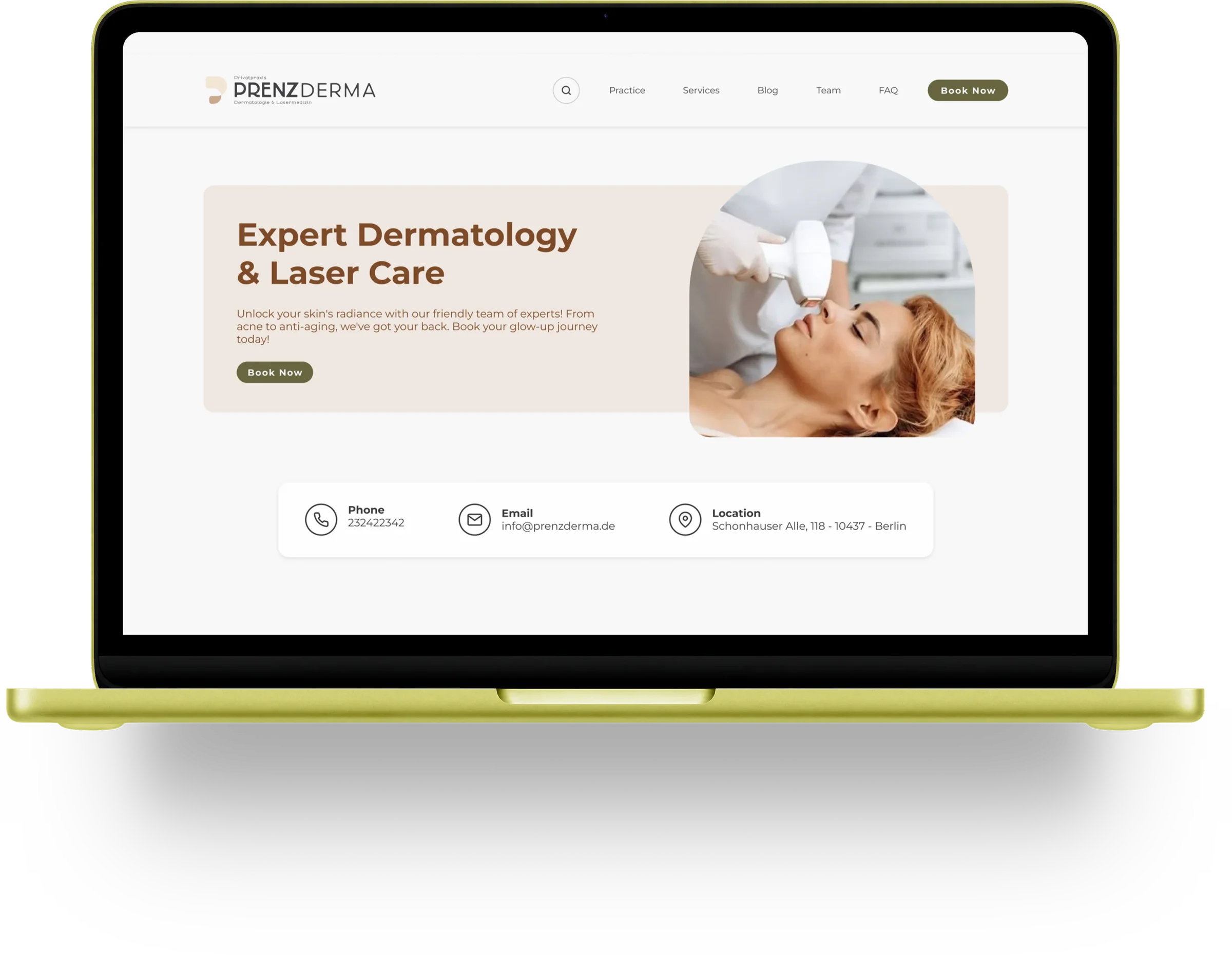
PrenzDerma website on a laptop
Context

Launching from Scratch

PrenzDerma was founded by two doctors to establish a premium practice in Berlin. Starting from zero, the business required a complete digital foundation to overcome a total lack of brand awareness and validate its patient acquisition strategy in a competitive market.

Challenge

Trust-Based Ecosystem

The challenge was to architect a high-trust digital ecosystem from scratch. We needed to transform brand identity into a seamless Webflow experience that guaranteed commercial viability in a highly competitive market during the clinic's crucial first year.

My Role

Product Designer

As the lead with end-to-end ownership, I bridged strategy, brand identity, and digital execution. I managed the project lifecycle and team priorities, defining the content architecture and designing a high-converting patient journey to align business goals with user needs.

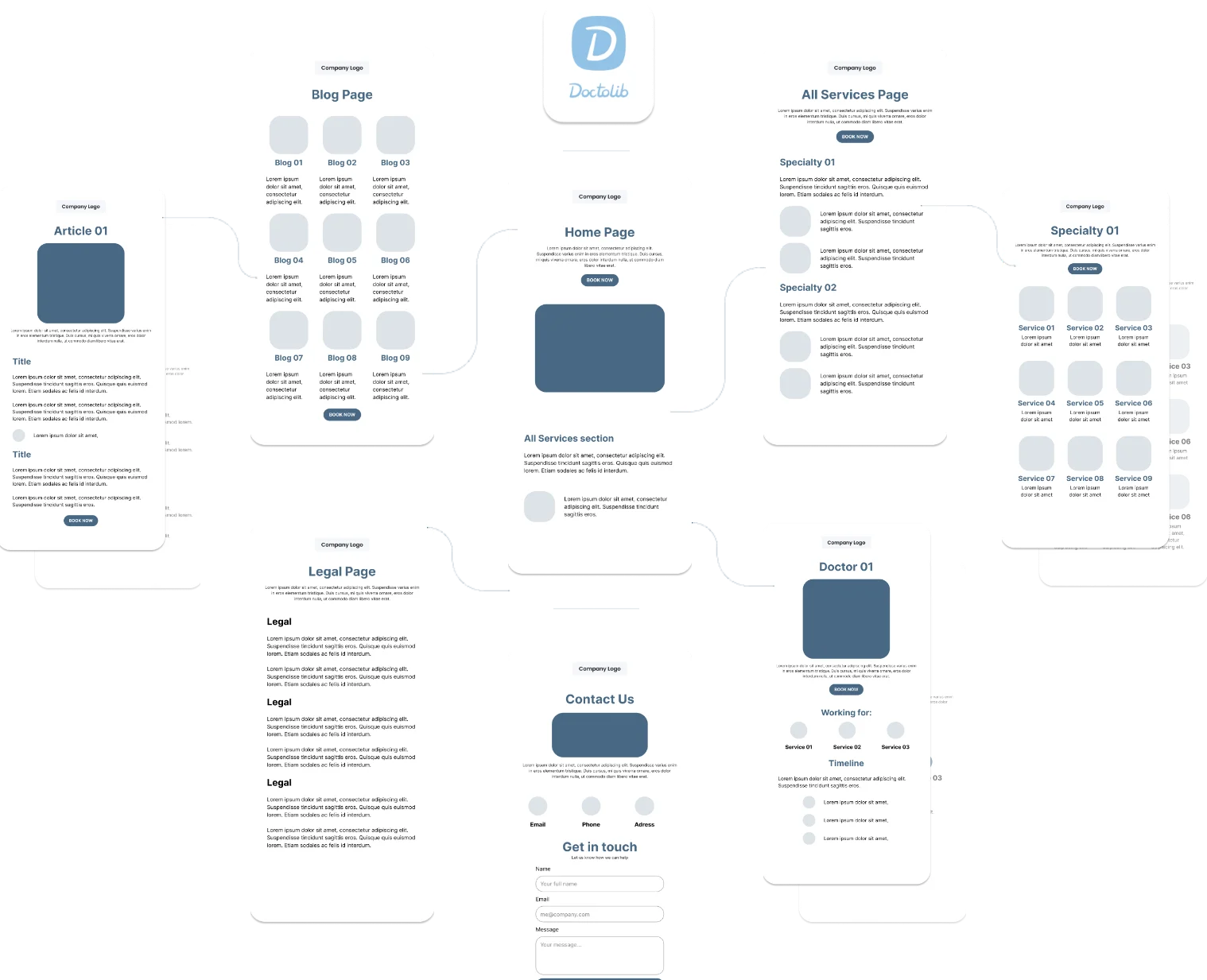
Sitemap wireframes: home, services, specialties, doctors, blog, contact, connected to Doctolib
Approach & Key Decisions

Designing for clarity over exploration

Since users were not familiar with the clinic, the experience needed to reduce uncertainty and guide them quickly toward action.

Instead of encouraging exploration, I focused on creating a clear and predictable journey.

To support that, I prioritized:

  • Straightforward navigation structure
  • Fast access to booking across the entire experience
  • Reducing cognitive load in key decision points
Approach & Key Decisions

Structuring a complex service offering

One of the main challenges was organizing more than 65 different services in a way that felt simple and approachable.

To address this, I introduced a structured system:

  • Grouping services into clear macro categories
  • Standardizing individual service pages
  • Providing concise descriptions with direct booking access

This allowed users to quickly identify what they needed without feeling overwhelmed.
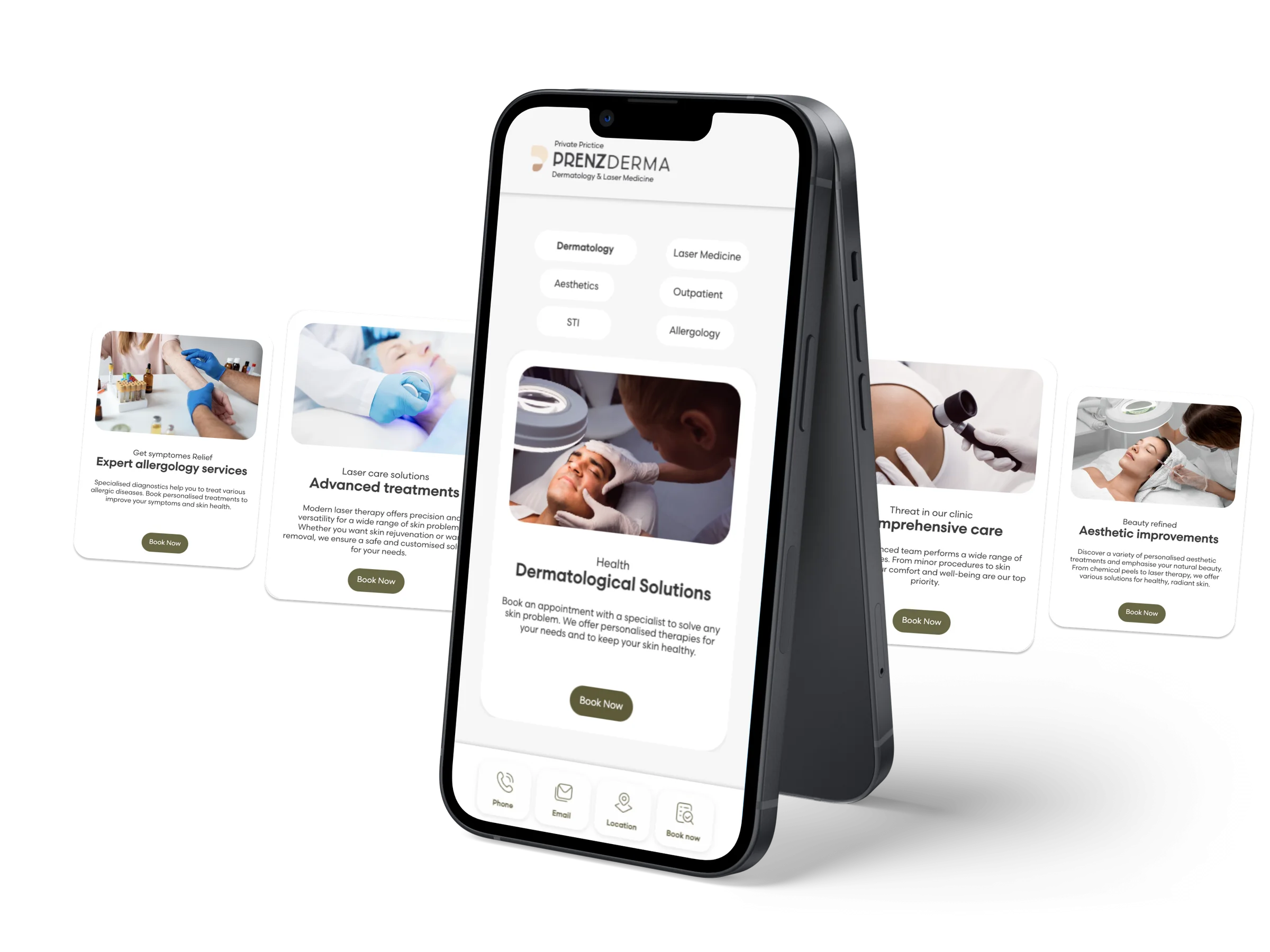
Mobile service pages
Approach & Key Decisions

Trade-off:
Depth vs Speed

The project had a fixed timeline of 12 weeks, covering multiple layers — from branding to development.

One of the key decisions was balancing exploration and delivery.

Instead of over-investing in early visual exploration, I prioritized clarity and execution, ensuring that the final product was cohesive, functional, and ready to support the business launch.

Approach & Key Decisions

Making booking
a core behavior

Rather than treating booking as a final step, I designed it as a continuous action throughout the experience.

  • “Book now” CTAs were strategically placed across multiple touchpoints
  • The integration with Doctolib reduced friction between intent and action.
  • The number of steps required to complete a booking was minimized

This ensured that users could act as soon as they felt confident enough.

Solutions

The solution combined visual identity, system thinking, and product decisions to create a cohesive and scalable experience.

Rather than approaching the project as a set of pages, I focused on building a structured foundation that could support both usability and long-term growth.

Visual Identity

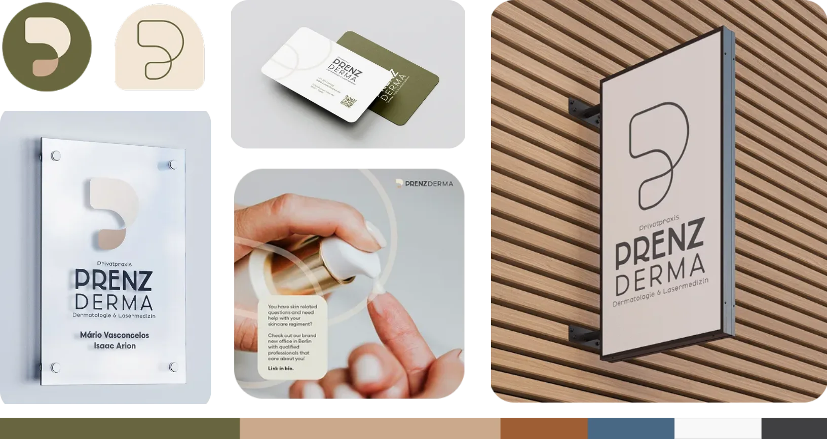
The visual identity was designed to reflect the clinic’s positioning: minimal, inclusive, & trustworthy.

  • A minimalist aesthetic to reduce noise and support readability.
  • Neutral color palettes to convey calmness and professionalism.
  • Subtle visual cues to reinforce a sense of sophistication without excess.
Brand applications: logo marks, business cards, door plate, social post and wall sign
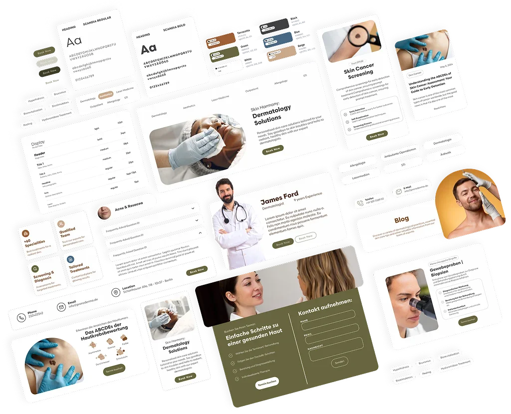
Design system components: typography, buttons, cards and page modules
Design System

A modular system built for long-term scalability and brand consistency:

This synchronized structure allows the clinic to scale their blog and specialty pages autonomously without the risk of breaking the layout.

  • Standardized hierarchy for clear content structure
  • Reusable components for service pages and CTAs
  • Consistent rules to maintain rhythm across pages
Product Decisions

1. Structuring
access to services

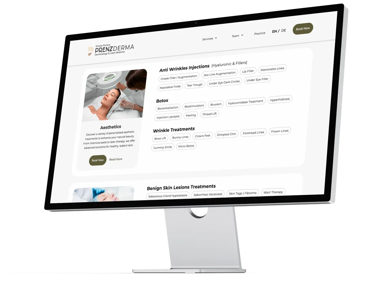
To simplify a complex offering, services were organized into macro categories, making it easier for users to navigate and identify relevant treatments.

Each service page followed a consistent structure, allowing users to quickly understand:

1. What the treatment is
2. Who it is for
3. How to proceed with booking

Service overview page on a desktop screen
Product Decisions

2. Reducing
friction in booking

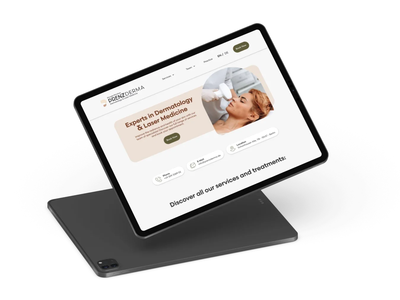
Elevating booking from a secondary step to a core user behavior.

To support this:

  • Booking CTAs were distributed across the entire experience
  • Integration with Doctolib enabled a seamless transition
  • The number of steps between intent and action was minimized
Home page with booking call to action on a tablet
Product Decisions

3. Supporting decision-making through content

Content played a key role in building trust and guiding users.

Instead of generic descriptions, each service was supported by structured and informative content, helping users:

  • Understand available options
  • Compare treatments
  • Make informed decisions
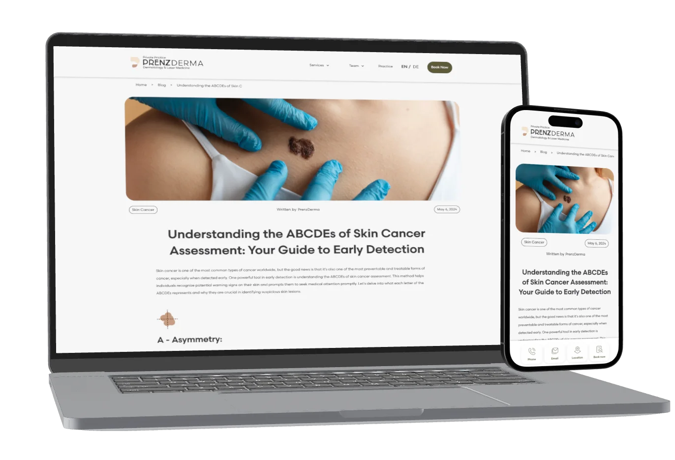
Blog article on laptop and phone
Outcome

By combining identity, system, and product thinking, the final experience was able to:

  • Communicate trust from the first interaction
  • Simplify complex information
  • Support user decision-making
  • Drive consistent booking behavior
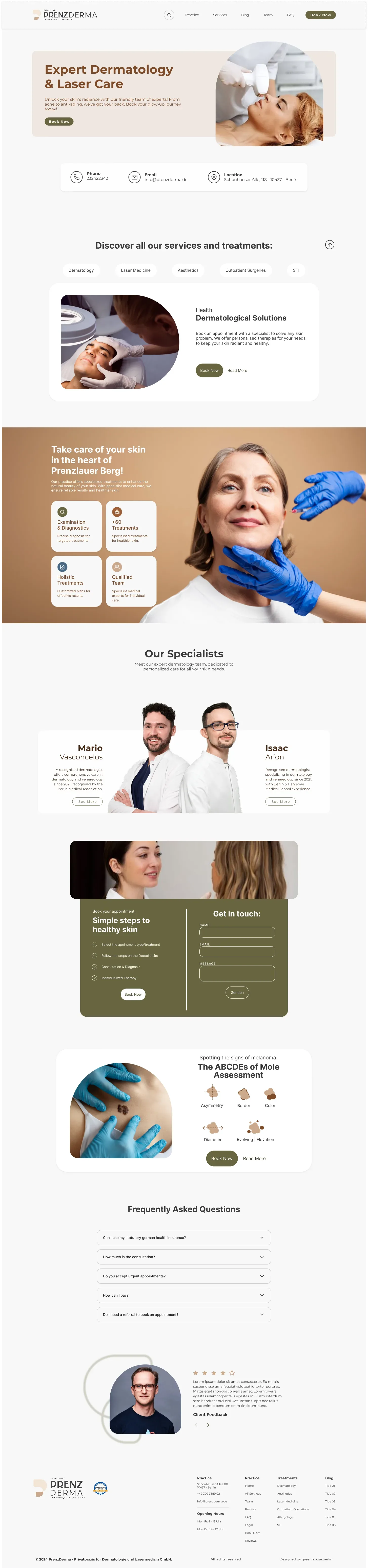
Full PrenzDerma home page

Scroll to see the full page

Performance

Strategic growth driven by data-informed design.

While multiple factors contributed to this outcome, the website played a key role as the primary entry point for new patients.

Shortly after launch, the clinic reported strong early performance:

Conversion70%of new patients came through the website
Capacity90%booking capacity reached across multiple weeks
Visibility50%increase in Google impressions driven by SEO and content
Learnings

Leading this project end-to-end reinforced the importance of balancing execution & strategy.

Working across multiple layers — from branding to delivery — highlighted the need to:

  1. Prioritize effectively under time constraints

    I learned to focus on what truly drives impact, rather than over-investing time in early-stage refinements.

  2. Designing systems, not just screens

    This shifted my approach toward creating structures that can grow over time, instead of designing page by page.

  3. Balancing execution & leadership

    This made me rethink how I distribute work and collaborate with others to create spaces for deeper strategic decisions.

  4. Designing for business outcomes

    This project reinforced a core principle in my work: Design is more valuable if it enables real-world results.

Portrait of Kaio Parmeggiani
Open to Work

Hello, I am

Kaio Parmeggiani

With over 10 years of experience across Product Design, UX Research and Strategic Planning, I specialize in translating complex problems into intuitive and scalable digital experiences.

I work end-to-end across discovery, interaction design and design systems, collaborating closely with product managers and engineering teams to deliver meaningful product outcomes.

Lets Talk
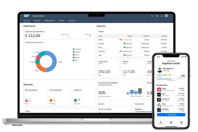
SAP Fioneer expense management on laptop and phone

Product Design | UX-UI | Figma | Germany

Digitalizing Corporate Financial Operations for Enterprise Scale

Redesigning ad-hoc expense management through an integrated multi-platform ecosystem focused on automation, compliance, and operational efficiency.

Read the Case Study